1. The Early Days: Simple and Functional
The first car logos were relatively simple. Automakers in the early 20th century focused more on functionality than branding. The logos were designed to help distinguish one car from another, as the concept of marketing a car as a lifestyle or status symbol had not yet taken hold.
One early example is the Ford logo. The Ford Motor Company, founded by Henry Ford in 1903, initially used a very simple logo consisting of the name "Ford" in bold letters. The logo was straightforward and no-nonsense, much like the company's philosophy of producing affordable, mass-market cars.
Similarly, the Chrysler logo, which was introduced in the 1920s, consisted of a simple winged emblem. It symbolized speed and freedom, capturing the essence of American motoring at the time. The wing motif has been retained in various forms over the years, and the logo has evolved to reflect Chrysler’s ongoing commitment to quality and innovation.
2. The Rise of Luxury and Prestige: 1930s - 1960s
As the automotive industry began to evolve, manufacturers began to realize the importance of brand identity. The 1930s marked the beginning of the luxury car era, with automakers like Rolls-Royce, Cadillac, and Mercedes-Benz developing logos that conveyed a sense of sophistication and elegance.
Rolls-Royce’s logo, consisting of two “R”s back-to-back, is perhaps one of the most iconic in history. It symbolizes the company’s commitment to creating the world’s finest cars. The Rolls-Royce logo has remained virtually unchanged for decades, emphasizing timeless luxury and craftsmanship.
Similarly, the Cadillac crest, introduced in 1905, underwent several redesigns in the 1930s and 1940s to better reflect the brand’s growing prestige. The crest, which represents the royal origins of the Cadillac name, has become synonymous with luxury, comfort, and performance.
Mercedes-Benz, another name associated with luxury, introduced its famous three-pointed star logo in 1909. The three points represent the company’s commitment to producing vehicles that are "engineered like no other car in the world," symbolizing the brand’s focus on innovation, quality, and performance.
3. The Era of Innovation: 1970s - 1990s
The 1970s to the 1990s saw a significant shift in automotive branding. As manufacturers began to explore new design philosophies, many logos became more streamlined and modern, representing the growing emphasis on efficiency and technological innovation.
One of the most notable rebranding efforts of this era came from Audi. In 1969, Audi merged with three other car manufacturers – DKW, Horch, and Wanderer – to form Auto Union. The new Audi logo, consisting of four interconnected rings, symbolizes the unity of these four companies. The logo has become synonymous with precision engineering and cutting-edge technology.
Another example is the BMW logo. Originally designed in 1917, the BMW logo represents the company’s aviation roots. The blue and white checkered design inside the circle evokes the Bavarian flag, and the rotating propeller image highlights the company’s history of producing aircraft engines. Over time, BMW’s logo evolved to represent the company’s shift toward automotive excellence.
Meanwhile, the 1980s and 1990s saw the rise of Japanese automakers like Toyota and Honda, who developed logos that reflected their emphasis on reliability and efficiency. Toyota's oval logo, introduced in 1989, is meant to symbolize the company’s “circle of continuous improvement.” It encapsulates Toyota’s philosophy of quality, innovation, and global reach.
4. Modern Logos: Minimalist and Geometric Designs
In the 2000s, automotive logos shifted towards minimalist and geometric designs. This era was marked by clean lines and simple shapes that were designed to reflect the modern, high-tech image of the brands.
One prominent example of this shift is the redesign of the Volkswagen logo in 2020. The new logo features a clean, flat design with the classic "VW" letters in bold, simple typeface. The logo represents Volkswagen’s focus on modernity, environmental sustainability, and innovation.
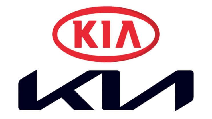
Another example is the Kia logo, which was redesigned in 2021. Kia's new logo features a geometric, stylized font that reflects the brand’s new focus on sustainability and electric vehicles. However, the logo sparked confusion, as many consumers misread it as "KN" rather than "Kia." Despite this, the logo represents a bold step forward for the brand, symbolizing a commitment to innovation and progress.
5. Iconic Car Logos That Have Stood the Test of Time
Some car logos have stood the test of time, remaining largely unchanged for decades. These logos have become part of the cultural fabric, representing not just the brand but the entire automotive industry.
Ferrari’s prancing horse logo, introduced in the 1920s, is one such example. The logo is a symbol of power, performance, and luxury, reflecting Ferrari’s status as one of the world’s most prestigious car manufacturers. The prancing horse, originally used as a symbol of the city of Modena, Italy, has become synonymous with Ferrari’s legacy of speed and racing success.
Another classic logo is the Chevrolet bowtie. Introduced in 1913, the Chevrolet logo has undergone minor revisions over the years, but it has remained instantly recognizable. The bowtie represents strength, reliability, and American ingenuity, and it continues to be a symbol of Chevrolet’s commitment to producing high-quality vehicles.
6. Conclusion: The Power of Car Logos
Car logos are not just visual representations of a brand—they carry deep cultural significance and tell the story of each company’s journey. From simple beginnings to modern, minimalist designs, car logos have evolved with the automotive industry, reflecting changing trends, values, and consumer expectations.
Whether it’s the luxury of Rolls-Royce, the innovation of Audi, or the performance of Ferrari, car logos are an essential part of the automotive world. They represent more than just the cars themselves; they embody the spirit of each brand and the experiences they promise to their customers. As the automotive industry continues to evolve, it will be fascinating to see how car logos continue to reflect these changes.
